Cardin is a business boasting a long history and a forward-thinking vision: a pioneer in the development of radio frequency devices and remote controls, the group today is a multinational. In the space of just five months, they participated in three different international trade fairs and at the same time worked on redeveloping their corporate identity. When designing the stands it was therefore essential to take multiple needs into consideration: to effectively represent the business, present its new image, and meet the needs for flexibility and functionality.
Creative and sustainable: Cardin stands produced using beMatrix
Cardin is a business boasting a long history and a forward-thinking vision: a pioneer in the development of radio frequency devices and remote controls, the group today is a multinational. In the space of just five months, they participated in three different international trade fairs and at the same time worked on redeveloping their corporate identity. When designing the stands it was therefore essential to take multiple needs into consideration: to effectively represent the business, present its new image, and meet the needs for flexibility and functionality.
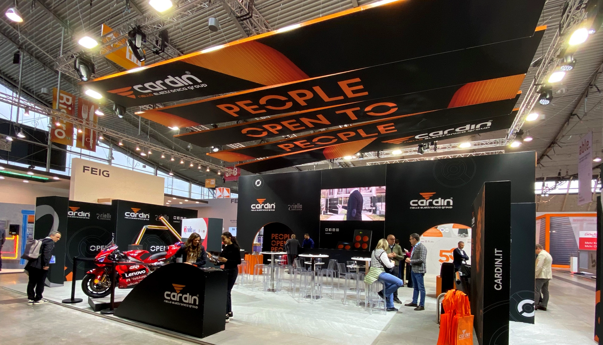
#TheChallenge
The aim of the project was to come up with a flexible, dynamic and creative stand concept, designed to adapt to the spaces it was to be installed in, as well as to allow for expansion and modification without the need for a total rethink.
#TheChallenge
The aim of the project was to come up with a flexible, dynamic and creative stand concept, designed to adapt to the spaces it was to be installed in, as well as to allow for expansion and modification without the need for a total rethink.
#DesignForDisassembly
In designing the stands we were guided by the principles of “Design for Disassembly”, which take into account factors including the repairability, replacement, updating and recycling of elements. Because reducing the environmental impact of trade fairs and events is no longer optional – it’s paramount.
#WhybeMatrix
The beMatrix system is one of the most sustainable on the market: it’s reusable, reconfigurable, and allows you to reduce logistics costs and simplify transport, assembly and movement of elements.
#WhybeMatrix
The beMatrix system is one of the most sustainable on the market: it’s reusable, reconfigurable, and allows you to reduce logistics costs and simplify transport, assembly and movement of elements.
#DestinationTradeFair
From France to Italy to Germany: in five months, the Cardin stand was deployed at three different trade fairs. And on each occasion, it was customized to suit the characteristics of available spaces and target visitors.
#DestinationTradeFair
From France to Italy to Germany: in five months, the Cardin stand was deployed at three different trade fairs. And on each occasion, it was customized to suit the characteristics of available spaces and target visitors.
#CreativeSynergy
The project was born out of a collaboration between three complementary companies: the graphic concept by Kora Comunicazione, sister company of the ABS Group which specializes in the creation of content for the development of corporate storytelling; the design concept by Remigio Architects, a team of architects and designers who develop bespoke architectural solutions; and final realization by the ABS Group.
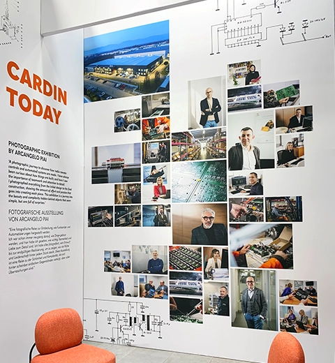
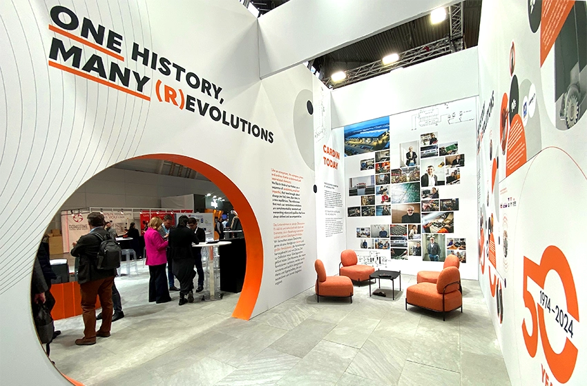


The stands created for Cardin in Rennes, Milan and Stuttgart
The three events where the Cardin stand was utilized were “ARTibat”, the construction fair in Rennes, “Sicurezza” the Italian fair dedicated to safety and fire prevention professionals in Milan, and “R+T” in Stuttgart, the leading trade fair dedicated to the world of doors and gates, roller shutters, and sun shading systems.
For each event, most of the structures were reused or adapted, with the addition of aluminium and fabric modules and coordination of the graphics, in which orange and black – the company’s corporate colours – predominated.
Stand configurations always featured a touch screen and totem with LED wall for screening videos about the business and its product.
The over-arching theme in all the exhibition projects was the “People open to people” concept, which evokes one of the functions of Cardin products, and at the same time tells the story of the group’s approach and openness to dialogue. This translates into an array of suspended structures at different angles, designed to convey dynamism and openness, and into the display graphics that reflect the claim and its various forms.
At the “R+T” trade fair in Stuttgart, the stand was extended to celebrate the 50th anniversary of the establishment of Cardin. “One History, Many (R)evolutions” was the concept that enhances the themes of equilibrium and evolution, around which we built a unique telling of the group’s history. For the display graphics, the shape of the circle was used, which nods both to the stand design itself (the two entrances to the booth), and the letter “O” used in the slogan “People open to people”. The contents are written within these circles, which then evolve to play on the more general theme of equilibrium. There is no shortage of hints of a “astronomical” nature, which we use to evoke the double meaning of the word “revolution”, since, in addition to its meaning of a change of state, it also describes the orbit of a celestial body around a gravitational source. The light background colour provides a contrast to the rest of the stand, conveying to the visitor the sensation of entering a different dimension, which is both coherent and chromatically opposite to the external dimension.

